Wednesday, September 30, 2009

Erte and Harper's Bazar


I thought since we have been discussing the design, attitudes etc. from the"Roaring Twenties" and also Russian Graphic Design, that it would be an appropriate tie in to talk about the artist and designer known as Erte'. Even though he may be predominately considered a fashion designer, Erte' was an illustrator and, I believe, a graphic designer since his work, in print, definitely conveyed a message. Romain de Tirtoff; ("Erte" was the french pronunciation of his initials) was born in Russia and worked in Paris. He made his American debut in 1915 on the cover of Harper's Bazar Magazine. For twenty-two years (from January 1915 to 1936) Erte's work would grace the covers of Harper's. His work during those years, "fabulously captured the times" and his work on so many covers have, in many ways, become historical documents of fashion and a visual commentary about the times.
I found it very interesting to look at many of his works. Art Deco is clearly represented but he most definitely had his own illustrative style. It is said he had complete and full artistic control over what he designed and had a huge influence on the fashion world. He was the only creative designer to illustrate his own creations (others were illustrating other designer's work). I also found what I thought to be a sort of correlation between DaDa art and Erte fashions, as he thought 'outside of the box' when it came to many details on his clothes: hats had animal ears, he put pockets on sleeves, dolls were turned into purses and tassels opened into fans just to name a few of his fanciful and original ideas.
After the mid 1930's Erte's popularity started to wane (although he designed for the theatre for many years after) the interest in his sketches, illustrations and paintings have surged in recent years and his Harper's covers are rare and cherished collector's items. Not many of his costumes have survived but his designs and contributions live on and are valued in themselves as serious works of art.

Works Cited:
Designs by Erte, Dover Publications. New York, N.Y.

Kristen Powers

Tuesday, September 29, 2009

Teddy Roosevelt and the "Teddy Bear"

Theodore Roosevelt was the 26th President of the United States and served in office in the early 1900s. He was considered a "multifaceted" man because he contributed so much to America. His efforts ranged from conservationism to nationalism and is especially famous for his efforts with the Panama Canal. Most interesting to me, however, was the story of the Teddy Bear and how it is said to have originated.

Nearly 100 years ago, President Theodore Roosevelt, went on a bear hunt. He enjoyed nature and being out in the woods where animals lived. Because he was the President of the United States, the people organizing the hunt wanted to make sure the hunt was successful.

But after 3 days of walking and climbing and riding, no bears were found. Now what? The President's bear hunt would be a failure!

The next day the hunt guide and his hunting dogs finally found an old bear. The dogs and guide followed the bear for quite a distance until the bear was very, very tired. The dogs attacked and injured the old bear. The guides tied the bear to a tree and called for the President. Here was a bear for him to shoot!

President Roosevelt looked at the poor old bear and said "no!" No one would shoot this old bear for sport. That would not be right. However, the bear was injured and suffering. President Roosevelt ordered that the bear be put down to end its pain.

A political cartoonist by the name of Clifford Berryman heard this story. A political cartoonist draws about current events in the news. Mr. Berryman drew a cartoon showing how President Roosevelt refused to shoot the bear while hunting in Mississippi.

If you look at the first cartoon that was printed about the President's bear hunt you see Theodore Roosevelt in the front. In the back is the guide with a bear tied on a leash. Notice that the guide and the bear are about the same size, suggesting a grown bear.

Look at the cartoon which appeared later in other papers. It has been redrawn. The bear is smaller than the guide. The bear is shaking with fear. This cute bear cub began to appear in other cartoons which Clifford Berryman drew throughout Theodore Roosevelt's career.

So that is how a bear became connected to the name of President Theodore Roosevelt.


But where do toy "teddy bears" come from?

After this famous cartoon appeared in the papers, a shopkeeper, Morris Michtom took two stuffed toy bears which his wife had made and put them in his shop window. He had an idea.

Mr. Michtom asked for permission from President Theodore Roosevelt to call these toy bears "Teddy's bears". This store eventually became the Ideal Novelty and Toy Company.

Other stuffed animals were made by a German company, Steiff. An illness left Margaret Steiff unable to walk. She refused to be stopped by her handicap and earned her living by sewing. First she made stuffed elephants, then other animals. In 1903 an American saw a stuffed bear she had made and ordered many of them.

The phrase caught on. Now toy bears are often called teddy bears!

http://www.theodoreroosevelt.org/kidscorner/tr_teddy.htm

http://inventors.about.com/od/tstartinventions/a/Teddy_Bear.htm


Alex Riggio

Monday, September 28, 2009

A. M. Cassandre


A. M. Cassandre is known for bringing the Art Deco movement to the United States. He was a Ukranian/ French painter, commercial poster artist, & typeface designer. His work was inspired by cubism & even some surrealism.


After he finished school, he set up his own ad agency called Alliance Graphique. He began to become more widely known when his poster designs for Dubonnet Wine Co. could be seen by occupants driving by in fast moving vehicles. In 1937, he created the now well known typeface, Peignot. Later on, he created covers for Harper's Bizzare magazine after they saw some of his pieces of work displayed in the Museum of Modern Art in NYC.


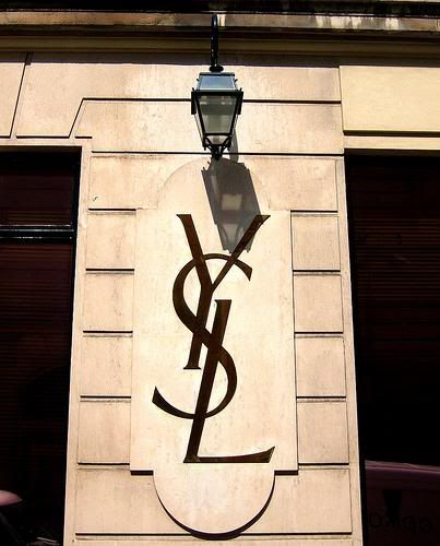
After awhile, he began serving in the French army. Once the war was over, his business was long gone but he still continued working aside from that & still got plenty of well deserved recognition out of it. In 1963 he designed the infamous Yves St. Laurent logo. Five years later, after coping with a long bout of depression, he committed suicide in his homeland of France.
Sheryl Mueller

Tuesday, September 22, 2009

Psychedelic Posters

Below: Wes Wilson


Originally coined by The Beach Boys, the word "psychedelic" has heavy connotations in our society to a specific kind of people. These people are open to expanding their perception and investigating the overlap between art and drugs. They are the hippies. And as important to hippies as their freedom of expression was, they loved the arts.

The psychedelic culture of the 1960s brought about a new appreciation for rock-n-roll with breakthrough musicians like The Beatles and Jimi Hendrix. With this new surge in musical renaissance, a need for art to accompany this music arose. Psychedelic posters drew inspiration for their bulging curvilinear style not only from LSD visuals but mostly from Art Nouveau and some Dada.

The most important aspects of a good psychedelic poster are starkly contrasting colors (to make them stand out), elaborate detail, wide curves, and most importantly, bizarre surrealism that makes one feel "dazed."

I personally love psychedelic art and the artists/musicians associated with it. While I am not a hippie, I still greatly appreciate the culture and the aesthetic that these artists were striving for. They were definitely not out of it when they created these beautiful posters that are really well thought out and revolve around complex themes. The artists conveyed an image and attitude for rock stars through a visual medium in a time when computers did not yet exist. They could not make a Myspace page to promote their band. And music was a lot less convenient to listen to than today. You could not just sample any band's music with the click of a button. Bands had to attract their target audience through these psychedelic posters. If you like the poster, it's very possible that you would like the band.


Above: Bonnie MacLean


And yes, psychedelic posters are hung in art galleries.


Sources:

http://denver.about.com/od/artsentertainment/ig/The-Psychedelic-Experience-/Psychedelic--Yardbirds.htm

http://www.oturn.net/probe/psychedelic-art.html


Tyler Pey

Monday, September 21, 2009

Hannah Hoch


While in class, we spoke briefly about Hannah Hoch, one of the first women in the graphic design industry. Being the person who began to allow both sexes into this art world, I wanted to search more on her background and life.


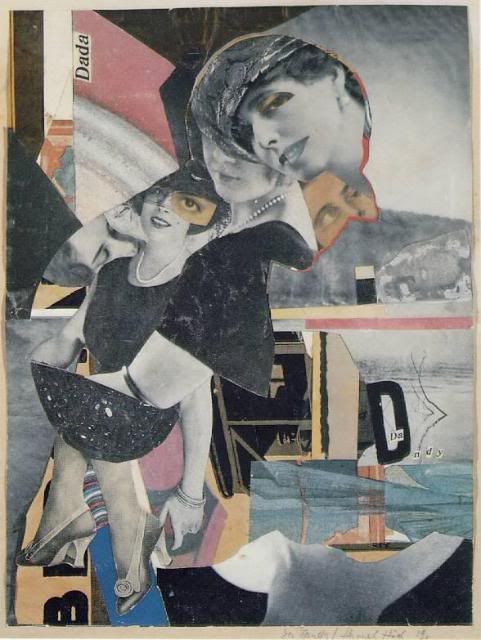
Hannah Hoch was a German Dada artist. Aside from being one of the first women in graphic design, she is also known for being one of the originators of photomontage. Hoch attended the Berlin College or Arts and Crafts and studied glass design and graphic arts, not fine arts, only to please her father. In 1919, she began working with the Berlin Dadists. Here she was a lone woman in the group. She referenced the hypocrisy of the Berlin Dada group and of German Society as a whole in her photomontage, Da-Dandy.


Many of her photomontages point out the faults of the beauty culture. Working at Verlang, she worked with many magazines that targeted women and she began to see how different women in media and reality are. She also made strong statements on racial discrimination in her work.


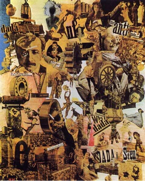
Her most famous piece of art is titled Cut with the Dad Kitchen Knife through the Last Weimar Beer-Belly Cultural Epoch in Germany, pictured below. This piece combines images from newspapers of the time re-created to make a new statement about life and art in the Dada movement.


S. Mueller

Frank Lloyd Wright


In high school, I was set on being an Architecture major and during that time span and even through now, Frank Lloyd Wright has been one of my favorite architects. Compared to others in his line of work and during his working years, he, to me, seemed to always think outside of the box & go one step further with his work, which I love to always try to do.

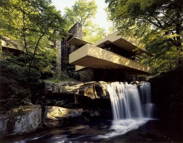
One of my favorite designs by him was the notorious Fallingwater house near Pittsburgh, PA. Fallingwater was built in 1934 and took three years to complete. It is considered to be a Modernism style and based on the design, I would consider it very modern for its time period.

The idea for Fallingwater came about by Wright saying one simple sentence over drinks at Fallingwater's resident, Kaufmann's, previous home. Wright was speaking with Kaufmann's son when he stated "...this house is not worthy of your parents". Kaufmann had overheard that statement & thus, Fallingwater was born.

It took Wright nine months to finalize the design. In the end, Kaufmann was surprised to see that the house was going to be built above the falls and not underneath like he had anticipated. "The construction was plagued by conflicts between Wright, Kaufmann and the construction contractor. The view of the building is such that the falls can be heard when inside the building, but the falls are visible only when standing on the balcony on the topmost floor. This type of geometrical architecture mystery has even puzzled the architect Wright himself." (Wikipedia).

The house was completed in October of 1937 and in the end cost $155,000, which in 2007 would be equivalent to $2.3 million. In 1963, Kauffman and his family donated the house to the Western Pennsylvania Conservancy and the house currently gets up to 135,000 visitors a year.

http://en.wikipedia.org/wiki/Fallingwater

S.Mueller

Sunday, September 20, 2009

Jules Cheret


Jules Cheret was a prolific artist during the Art Nouveau movement in France during the early 19th century. I wanted to explore his work because I really love the color, movement, and whimsy of his pieces. I also was interested in learning about his life and influencing experiences because his work is so decorative. This entire era is intriguing to me in regards to graphic design because it is so far from what we do today. However, I also enjoy this work a lot because it is so illustrative and captivating.

Alex Riggio

I found this great website that has everything you would want to know about Cheret, his life, and his work. On the home page of the site, you will find this blurb about the beginnings of his life work. Jules Cheret was born in Paris on May 31, 1836 in to a family of artisans. Since the family had little money, Jules Cheret’s formal education ended when at the age of 13, his family could no longer afford to keep him in school. His father, a typographer, placed Cheret in a three year apprenticeship with a lithographer.

http://www.cheret.info/
"French lithographer, poster designer and painter, Cheret’s formal training in art was limited to a course at the Ecole Nationale de Dessin, Paris, as a pupil of Horace Lecoq de Boisbaudran.

Although he was able to sell sketches to various music publishers in Paris, this did not satisfy Cheret. He left Paris for London in hopes of finding a more lucrative way to afford his career as an artist. After a short period of time executing drawings for The Maple Furniture Company, a frustrated Cheret, returned to Paris with no more money than when he began his journey. This did not deter him and his continued perseverance led him to his first commission to create a poster. This would later reveal him to be The Master of the Poster."

I perused through the site some more, and one of the most interesting things I read was about his influences with color and how he began a "color revolution". He also produced many works for the Moulin Rouge and did decorative panels, posters, and paintings that were highly influential in Parisian society during the time.

Sunday, September 13, 2009

Victorian Houses


I've always had an interest in interior design and architecture, and the Victorian era produced homes that interest me a lot. The Boyle House was built in 1890 and features many unusual Victorian elements such as a Queen Anne Tower; embossed, raised, metal flower garlands decorating the porches; rosetted brackets; porches with turned balusters, spindles and columns; and leaded-beveled glass and circle top windows. Unusual interior features include ornate flowered, tile-faced columned and bevel-mirrored oak fireplace mantles with wood carvings, and embellished summer grates; unique gas /electric brass and crystal chandeliers (gasoliers); beautiful hardwood floors and woodwork. http://www.herinn.com/?page_id=3 Many homes today still stand from the Victorian era and even some new architecture exists when building brand new homes. Victorian homes were intended to be romantic, peaceful, and elegant, reflective of the time and attitudes of the people.

The interiors of the homes especially exemplified the elegance and attention to detail of the era. Although some find it to be overkill with the elaborate and excessive embellishments, there is some beauty to the fine detail crafters paid attention to in designing pieces. The picture above is from a Victorian bed and breakfast located in Texas. This room in particular is the drawing room where many social affairs were held. http://www.benefieldhouse.com/common_rooms.html

A Victorian is a house constructed during the Victorian era, approximately 1840 to 1900. During the Victorian era, industrialization brought new building materials and techniques. Architecture saw rapid changes. A variety of Victorian styles emerged, each with its own distinctive features. http://architecture.about.com/od/housestyles/ig/Victorian-House-Styles/

Alex Riggio

Friday, September 11, 2009

How Typefaces have Changed

While browsing around on the AIGA's archives, I found several designs, both contemporary & not, that caught my attention. I then ventured to the thinkingwithtype.com website we were given & was led to yet another page, fontbureau.com, a Boston type foundry which produces both historical and new, modern typefaces. A few of the original fonts that they have made include Caslon, Bodoni, & Garamond.
This site drew me in mostly because I find it amazing that even though typefaces began to be designed several years ago, there are still people out there that find the need to keep recreating it in their own shops for designers & everyone else to use. I also find it interesting how years later designers can still find a place for older fonts in their work. Nowadays when things change, we as humans tend to follow the trend, leaving behind the old. It turns into a 'what if', thinking about how all of the historical fonts could have been left behind as new ones became developed therefore making those fonts just that, history. What if that had changed design as a whole? Where would we as designers be today?

There were also a few fonts on fontbureau.com that I found that reminded me of the older, historical fonts, some including Antenna, Antique Condensed, Belizio, & Escrow, pictured on the left in order. The designs on these fonts were similar to those created when typefaces was first widely used which, again, amazes me that there are still people out there today who take the time to design typefaces that would take more time than a simple font to design such as Helvetica.


Sheryl Mueller

Monday, September 7, 2009

Fabriano Paper

I looked at the AIGA design archives and specifically at some of the typography design. Of course there are so many fabulous designs (goes without saying, really) but there was one, in particular, that I think is really amazing . I love paper crafting so Paper Alphabet for Sculpture Today by Phaidon Press, 2007 is really wonderful in that it looks so simple (but as designers, we know that it wasn't!!). Unfortunately I can't post or copy that imagery here but it got me thinking about paper and how it (paper) changed the world in so many profound ways.
I wanted to look at Fabriano Paper. Started in the late 13th century, it is still a leader in the paper industry today. (above is a picture of the Museum of Paper and Watermarks.)

"In all likelihood, the reason that Fabriano became the most important papermaking center in Europe can be found in the fact that it is located near Ancona, a port particularly open to commercial exchanges with the Arab world. It must also be noted that the ever greater skill shown by the growing numbers of qualified craftsmen in Fabriano led to a significant increase in the quality of the paper made here. Two important process innovations led to the rise of Fabriano as the cradle of papermaking in the modern conception of this term. One was the use of animal gelatin for surface sizing of the paper. This innovation permitted better writing on the sheet and solved the problem of aging caused by starch sizing, the main reason that chancelleries and notaries were forbidden to use paper for public deeds.

The second innovation was the invention of the hydraulic hammer pile with multiple screens (13th century) used to beat the rags, thus eliminating the stone mortar and wooden pestle, which had to be operated by hand, in use among the Arabs.

Another major product innovation in Fabriano was the use of watermarks on sheets so that when they are held up to light, these famous symbols can be seen. They were used initially to reproduce the trademark of the different papermakers."
http://www.cartierefabriano.it/uk/_storia.html

kristen powers

Wednesday, September 2, 2009

Typography Investigated


For the first week's assignment, I investigated AIGA's archives and came across quite a few designs that I really enjoyed. However, because AIGA protects their archives, we are not allowed to copy links or photos and post them to the site. I also looked into Lupton's site and came across a lot of typefaces and information that I really liked. On James Craig's site, www.designingwithtype.com I found some interesting student work of type designs that he published. This particular design interested me because it seems to have a Gothic tradition with a very modern flair.

The design on the top is neat because it is very modern, but very clean and simple. It's fun to compare the two and see how very different the typefaces are. I can really appreciate the effort that both students made with designing type and I admire their persistence at making the typefaces become as uniform as possible.

One of my favorite things I came across is the "T Openers: Lace, Swirl and Damned" archive on AIGA's site. It's done so intricately and beautifully and while it only uses one letter (T) I think the design quality is really awesome. It's very lacey and pretty but within a Gothic style typeface. It reminds me of something we may see in the Victorian Era.

There is also a card on AIGA's site called "Joy" that is really cool. It folds out and the letters j, o, and y pop up. I've always found it amazing that we can do so many things with paper and that a few simple folds could enhance a piece from good to great.

Alex Riggio