Friday, December 11, 2009

The Grunge Style

This really interested me because it's very edgy and has created a lot of controversy over the years. I found a cool article describing the grunge movement and what it was about with some good pictures for references.

As Web 2.0 style passes way, it’s time for something new. Few weeks ago we’ve written about the hand-drawing style in modern web-design. And as Web 2.0 style is all about glossy and shiny look, another option would be something rather crude, radical and provoking. Such as the grunge style — dirty look with irregular, nasty, sometimes even ugly and crooked visual elements. Will it establish itself as a trend? Probably not. However, it may be used once some creative and unconventional design approach is needed.

Below we’ve collected everything you would ever need for a perfect design in a grunge style — design examples, free fonts, icons, textures, brushes and even few tutorials.

http://www.smashingmagazine.com/2008/01/29/grunge-style-in-modern-web-design/

Grunge doesn’t necessarily stand for dirty. Grunge designs may have subtle dirty elements, providing the content with the dominant position it deserves. Let’s take a look at some examples how it might look like. All screenshots are linked and lead to the sites from which they have been taken.


This was interesting to read because it offered more for us to look at and be inspired by! Check out http://www.bittbox.com/freebies/5-excellent-free-grunge-fonts


Alex Riggio

End of Semester

Throughout the past four months, I have learned a lot from this class. Being a graphic design major, I knew about modern style and history but I never really knew much about how graphic design came to be from day one. It was interesting to learn that graphic design first got its roots dating all the way back to Egyptian times. The way that each style came to be was intriguing as well. I also enjoyed seeing all of the different styles presented to the world and how a lot of them are still used today in some way. Knowing graphic designs roots has helped me to explore my styles more as well. I look forward to taking Graphic Design History II and expanding my knowledge about the modern history and I also look forward to learning more to help expand my design styles.

S. Mueller

April Greiman


April Greiman was born in 1948. She is one of the first designers to embrace computer technology as a design tool in 1984. She is also credited with bringing New Wave design to the US.


Her work evolved when she studied at the Basel School under Hofmann and Weingart in the early 70s.


She explored pixelation and other "errors" in digitalization as a part of digital art.


Presently she heads the design firm Made in Space in LA.


S.Mueller

Wolfgang Weingart


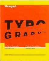
Wolfgang Weingart was born in 1941 in Germany. He is internationally known as a graphic designer and typographer. He is catergorized in Swiss typography & is also considered the "father" of New Wave design & Swiss type.


He first developed an interest for the arts when he moved to Lisbon with his family. In 1958, he studied graphic arts and the Mertz Academy. He later taught at the Basel school of Applied Arts and still teaches a summer class there today.


Weingart said he never forced style on any of his students nor did he ever intend to create a 'style'. He said his students just 'misinterperted' his teachings and pegged it as "Weingart" style.


S. Mueller

Saturday, December 5, 2009

Saul Bass

http://stephen.banksie.co.uk/research/wp-content/uploads/2009/01/poster_saul_bass_homemcombracodeouro1.jpg
http://www.hinduonnet.com/thehindu/mp/2006/06/06/images/2006060600540401.jpg http://tallerochoa.uchilefau.cl/wp-content/uploads/2009/05/saul-bass-vertigo-movie-poster1.jpg
SAUL BASS (1920-1996) was one of the great graphic designers of the mid-20th century and also a master of film title design thanks to his collaborations with Alfred Hitchcock, Otto Preminger and Martin Scorsese.

posted by: Kristen Powers

Thursday, November 12, 2009

Paula Scher


Paula Scher is well known throughout the Graphic Design scene, mostly for her controversial 'Swatch' ad. She is also well known for several other various artworks.


Scher studied at the Tyler School of Art in Philidelphia and began her career as a record cover art director at both Atlantic and CBS records in the 70s. In 1984 she co-founded Koppel & Scher & in 1991 she joined Pentagram as a partner.


In the 70s & 80s, her eclectic, period oriented typography became widely influential & imitated. She is also credited as a major proponent of "retro" design. Scher says she uses historical design to make visual analogies in her work.


She currently teaches at the School of Visual Arts in NY and has for 19 years. She is also credited with several identities we use today such as Citibank, Tiffany & Co., Target, & The New York Times.


S. Mueller

Andy Warhol-Pop Sensation

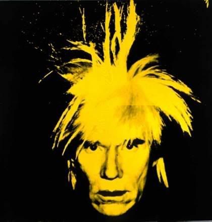
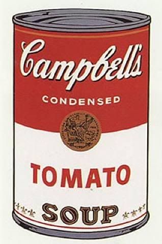
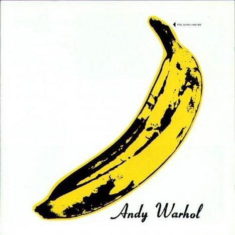
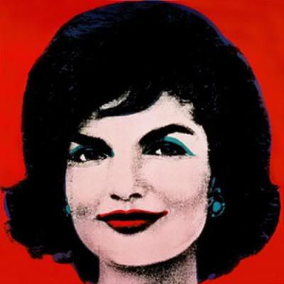
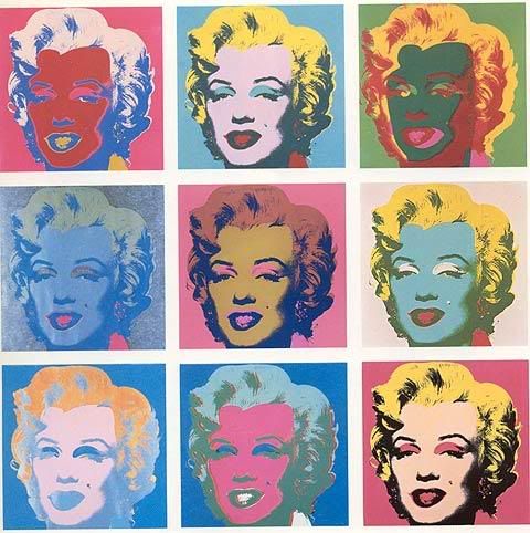
Andy Warhol was one of the most popular and controversial artists that began in the 50s & 60s. He was a painter, printmaker, & filmmaker & was one of the leading figures in the visual art movement, Pop Art. He is also known for his famous line "15 minutes of fame".

As a child, Warhol became a hypochondriac & due to that was often bedridden. Missing out on so much he became an outcast with other children. While he was in bed though, he began drawing, listening to the radio & collecting pictures of movie stars, which he claims was a period of importance in his development.

Later he studed at Carnegie Institute of Technology, now more famously known as Carnegie Mellon & in 1949, he moved to NYC. There he was hired by RCA to design album covers and promotional materials. In 1968, he painted his famous 'Campbells Tomato Soup Can'. He named his studio "The Factory" & he began his silk screen methods here. He had some ups & downs in his career from that point on until his death in 1987. He is still widely popular in the art world and his works can be visited at The Andy Warhol Museum in his hometown of Pittsburgh, PA.

S. Mueller

http://en.wikipedia.org/wiki/Andy_Warhol


Sunday, November 8, 2009

The Beatles


The British Invasion of music into the States was one of the most prominent musical movements of all time. I found some interesting things online that told more about how they began and ended their musical journey.

Introduction

“I have never seen anything like it. Nor heard any noise to approximate the ceaseless, frantic, hysterical scream which met the Beatles when they took the stage after what seemed a hundred years of earlier acts. All very good, all marking time, because no one had come for anything other than the Beatles...

Then the theatre went wild. First aid men and police – men in the stalls, women mainly in the balcony – taut and anxious, patrolled the aisles, one to every three rows.

Many girls fainted. Thirty were gently carried out, protesting in their hysteria, forlorn and wretched in an unrequited love for four lads who might have lived next door.

The stalls were like a nightmare March Fair. No one could remain seated. Clutching each other, hurling jelly babies at the stage, beating their brows, the youth of Britain’s second city surrendered themselves totally.”

Derek Taylor (From his book “Fifty Years Adrift”

1969

Following the White Album(and the magnificent Hey Jude) they made Let It Be and with the final regal glory of Abbey Road they left their grieving fans a legacy that will never be matched.

In the inevitable breaking down of old liaisons, there was room for growth. John met and married Yoko; Paul met and married Linda. George matured far beyond his years, settled into his spiritual space and expressed himself writing classic songs; Ringo was now writing his own numbers and was widely acknowledged as a supreme drummer and a very good actor. To everything there is a season.

That the rift between The Beatles, evolved with much public angst was a pity but this is not a perfect world is it?

Relationships anyway, were repaired long ago.

And in the end, the equation between the love they took and the love they made was intact into infinity. They still represent the twentieth century’s greatest romance.

http://www.thebeatles.com/#/history/1969

Lillian Bassman


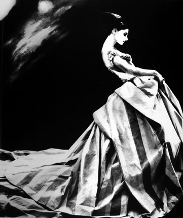
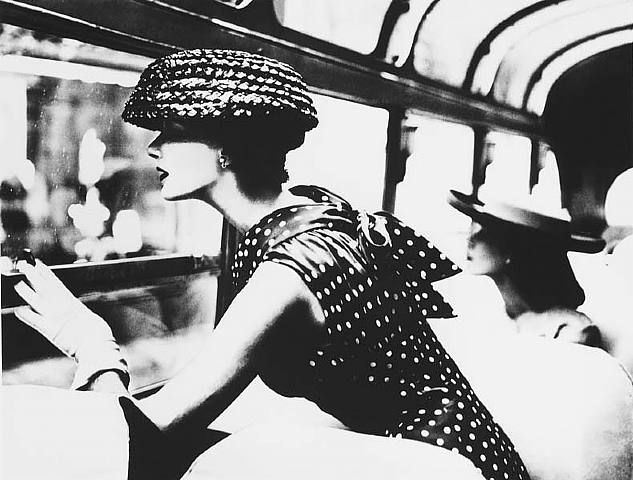
Lillian Bassman is a female painter and photographer that used an experimental process to create art. Her work centered around the feminine; always elegant yet edgy for the time. I found this really interesting article about her tiredness of the world of fashion photography and how she destroyed a bunch of her negative prints in retaliation. Interestingly enough, she went back many years later to try to salvage the pieces and create something new from what she dug out of her trash can. Check out the article and some pictures!

http://www.nytimes.com/2009/07/17/arts/design/17bassman.html
Alex Riggio

Monday, November 2, 2009

Eye Magazine: Meanings of Type

After reading the article The Meaning of Type on the Eye Magazine website, it was interesting to learn how much type has been through throughout the years. One thing that caught my attention the most was that the use of lowercase and uppercase letters together wasn't tampered with until the early 1920's. It was also interesting to learn how some typefaces we still widely use today came to be and how some typefaces were designed solely for the use of advertising and afterwards were used for more than that.

S. Mueller

Wassily Kandinsky


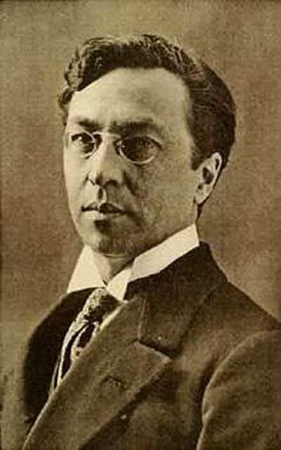
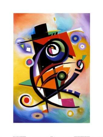
Wassily Kandinsky was the first person to be credited with creating modern abstract works. He originally was not even an artist and did not pursue that profession until his later years.


Kandinsky enrolled in the University of Moscow and studied law and economics. It wasn't until 1896, at 30 years old, that he quit his very promising profession to enroll in a Munich art school. He wasn't admitted right away so he began to teach himself art. He was influenced greatly by Monet's 'Haystacks' and Richard Wagner's 'Lohengrin'.


Kandinsky called his art 'inner beauty, fervor of spirit, and deep spiritual desire, inner necessity'. None of his paintings emphasized human beings, they were more abstract figures.


Kandinsky also was an art theorist, helping to found the Neue Kunstlervereinigung Munchen or the New Artists Association and in 1909 he became the president. After their demise in 1911, he is credited with forming the Blue Rider Group. Kandinsky taught at the Bauhaus in Germany but once that closed he moved to France where he died in 1944.


S. Mueller

Saturday, October 17, 2009

Frank Lloyd Wright

Frank Lloyd Wright loved nature and it was expressed consistently through his works. His buildings never had a basement or attic, mimicking a horizontal plane. The ceilings were always low (possibly to compensate for his small stature) and the windows were often uninterrupted walls so that one would feel closer to nature. His simplistic houses served as inspiration for a new style of architecture in the Midwest called the Prairie School. He would later become one of its chief practitioners.
In his lifetime, Wright's style began to grow rapidly in popularity in the United States and Europe. As his popularity grew, he made more dramatic structures. When he built skyscrapers, they mimicked trees with a central trunk and branches coming out. He loved to use natural elements and forms. It was his dream for these natural elements to become the basis of American architecture.
Wright's biggest project was the Taliesin which was an architectural fellowship where young students could pay to work and learn from him. He gathered a total of thirty apprentices. He would continue to expand as the number of apprentices grew. Through the Taliesin Fellowship, Wright was able to create the Kaufmann House in Pennsylvania and the SC Johnson Wax Administration Center in Wisconsin.

I personally am not the biggest fan of Frank Lloyd Wright's style. While it is extremely luxurious and undeniably interesting, it isn't very practical. I feel like no one would ever live in buildings like his and therefore have no value in the real world.

- Tyler Pey

Monday, October 12, 2009

Russian Constructivism

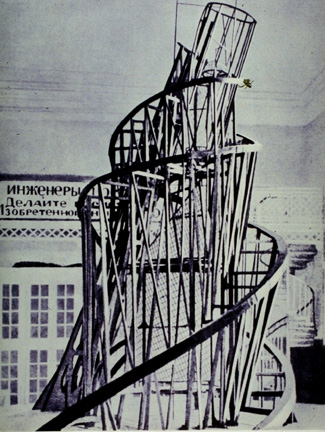
Russian Constructivism was a movement that was active from 1913 to the 1940s. It was a movement created by the Russian avant-garde, but quickly spread to the rest of the continent. Constructivist art is committed to complete abstraction with a devotion to modernity, where themes are often geometric, experimental and rarely emotional. Objective forms carrying universal meaning were far more suitable to the movement than subjective or individualistic forms. Constructivist themes are also quite minimal, where the artwork is broken down to its most basic elements. New media was often used in the creation of works, which helped to create a style of art that was orderly. An art of order was desirable at the time because it was just after WWI that the movement arose, which suggested a need for understanding, unity and peace. Famous artists of the Constructivist movement include Vladimir Tatlin, Kasimir Malevich, Alexandra Exter, Robert Adams, and El Lissitzky.

posted by: Kristen Powers

works cited:

http://www.arthistoryarchive.com/arthistory/constructivism/

Sunday, October 11, 2009

Maxfield Parrish

Maxfield Parrish (1870-1966) was a popular American artist during the "golden age of illustration". His many illustrations for children's books, and magazine covers as well as his ads for products such as, General Electric and Jell-O also made him a graphic designer of sorts. Parrish also did paintings specifically for art print reproduction, which became immensely popular with the new middle class.
Although Parish was predominately a painter, he was also a gifted writer and was known for his use and knowledge of color (some even refer to "Parrish Blue").
He enjoyed immense public recognition during the Art Nouveau and Art Deco periods, even though his work was executed in a wholly personal style, something which is seldom achieved by most artists.


Kristen Powers

works cited:
Maxfield Parrish. Ludwig, Cory. Schiffer Publishing, Atglen, Pa. 1973
http://parrish.artpassions.net/


Shepard Fairey /Propaganda Poster Art

1920s by Russian Constructivist artist Alexander Rodchenko


Contemporary artist, graphic designer and illustrator Shepard Fairey took interest in The Afternoons, creating a poster campaign featuring the title of the bands first single "Say Yes." The posters appeared around Los Angeles shortly after Fairey's "Obama Progress" Campaign.


This is just one example, of many, that I found of contemporary propaganda poster art that draws it's inspiration by looking back on history.
When you mention political and/or propaganda art in today's society, you will most certainly run across the name and work of Shepard Fairey. Fairey began his career as a 'street' artist and his work was licensed on products such as skateboards and t-shirts. He is, probably, best known for his Obama "Hope" poster from the 2008 U.S. Presidential campaign.
His work draws much fire from critics who say that Fairey appropriates the work of others, some even going so far as to call him a plagiarist. The Obama poster has caused much controversy due to the fact that Mr. Fairey did appear to use an A.P. photo as his "guide". In today's world it may be easier, with the aid of the computer and software such as Photo shop,
to 'incorporate' the works of others but, in my humble opinion, the critics should not be so quick to cast harsh aspersions on the artist. After all, with other names such as Andy Warhol and Roy Lichtenstein, isn't he in good company?


Kristen Powers
works cited:
Shepard Fairey
Obey Giant
Mark Vallen
Related Topics

Sunday, October 4, 2009

Uncle Sam


So, we're all very familiar with the nostalgic imagery of Uncle Sam pointing his finger and saying, "I want you for the U.S. Army" and because of our class discussions regarding the differences in posters between the Central Powers and the Allied Powers, I was curious about the story of how Uncle Sam really came to be. The poster was designed by James Montgomery-Flagg in 1916. It made its first appearance in Leslie's Weekly and was printed throughout 1917 and 1918.

Uncle Sam is one of the most popular personifications of the United States. However, the term "Uncle Sam" is of somewhat obscure derivation. Historical sources attribute the name to a meat packer who supplied meat to the army during the War of 1812--Samuel (Uncle Sam) Wilson (1766-1854). "Uncle Sam" Wilson was a man of great fairness, reliability, and honesty, who was devoted to his country--qualities now associated with "our" Uncle Sam. James Montgomery Flagg (1877-1960) (American Treasures of the Library of Congress). http://www.loc.gov/exhibits/treasures/trm015.html

The poster was designed for use during World War I, but was later employed again during WWII by FD Roosevelt. Another source discusses Uncle Sam: Uncle Sam is the cartoon embodiment of the government of the United States of America, a character who appeared in newspapers and magazines beginning in the first part of the 19th century. The commonly accepted version of his origin, or at least the best explanation anyone's been able to supply, is that he was modelled after Samuel Wilson, a meat purveyor to the United States army during the War of 1812. Known as "Uncle Sam," Wilson put his initials on his goods. The initials U.S. were also taken to stand for United States. Over the years Uncle Sam evolved into a tall, white-haired man with beard, sporting patriotic colors and a top hat. The most common modern image can be traced to his depiction by James Montgomery Flagg from 1916, for a military recruitment poster calling "I Want YOU For the U.S. Army." (Answers.com)
http://www.answers.com/topic/uncle-sam

Both sources describe the story similarly. It's pretty interesting how a fictitious character has been a successful heroic image for all this time.

Alex Riggio

Saturday, October 3, 2009

Suprematism


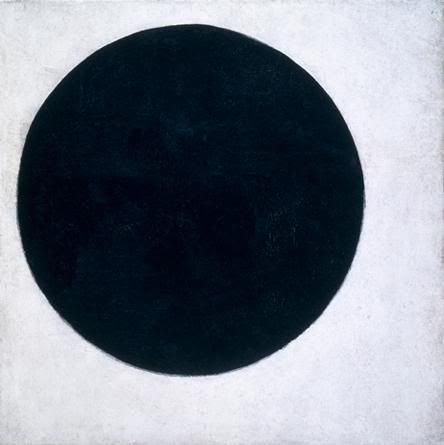
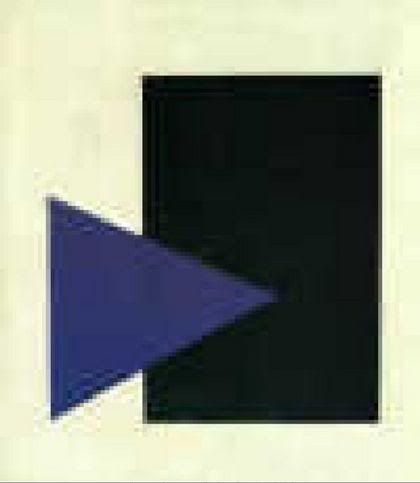
Suprematism was created by previous cubo-futurist, Kasimir Malevich. The birth of Suprematism was thanks to Victory Over the Sun, a futurist opera production in 1913 and was also influenced by the ideas of a Russian mathematician, philosopher, & disciple named Georges Gurdjieff P.D. Ouspensky. Malevich introduced the idea of Suprematism to the public through his manifesto 0.10 The Last Futurist Exhibition.

Suprematism focused on fundamental geometric forms like the circle & square. It was first announced around 1915-1916 in Russia. Malevich thought one painting he did of a black square on a white background was such a powerful image to him because "I felt only night within me and it was then that I conceived the new art, which I called Suprematism." He believed that "Suprematism is the rediscovery of pure art that, in the course of time, had become obscured by the accumulation of "things" and that "The artist (the painter) is no longer bound to the canvas (the picture plane) and can transfer his compositions from canvas to space".

Critics did not take likely to the Suprematism movement and the trend quickly faded. The public said "Everything which we loved is lost. We are in a desert . . . . Before us is nothing but a black square on a white background!"

Though there was a short period of time where Suprematism & Constructivism crossed over, Constructivism quickly took over the spotlight. In 1919, Malevich announced the demise of Suprematism. Today though the same forms of art are still used. Nowadays artists and the public can look at a circle on a white background and feel something from it, read a message out of it of what the artist was trying to say, & be influenced greatly by it. Suprematism had a major impact on the things we call art today. It never really 'died'. It was just overlooked because it was something new and different that the world wasn't ready for just yet.

http://wwar.com/masters/movements/suprematism.html
http://en.wikipedia.org/wiki/Suprematism
http://tars.rollins.edu/Foreign_Lang/Russian/suprem.html


Sheryl Mueller

Wednesday, September 30, 2009

Erte and Harper's Bazar


I thought since we have been discussing the design, attitudes etc. from the"Roaring Twenties" and also Russian Graphic Design, that it would be an appropriate tie in to talk about the artist and designer known as Erte'. Even though he may be predominately considered a fashion designer, Erte' was an illustrator and, I believe, a graphic designer since his work, in print, definitely conveyed a message. Romain de Tirtoff; ("Erte" was the french pronunciation of his initials) was born in Russia and worked in Paris. He made his American debut in 1915 on the cover of Harper's Bazar Magazine. For twenty-two years (from January 1915 to 1936) Erte's work would grace the covers of Harper's. His work during those years, "fabulously captured the times" and his work on so many covers have, in many ways, become historical documents of fashion and a visual commentary about the times.
I found it very interesting to look at many of his works. Art Deco is clearly represented but he most definitely had his own illustrative style. It is said he had complete and full artistic control over what he designed and had a huge influence on the fashion world. He was the only creative designer to illustrate his own creations (others were illustrating other designer's work). I also found what I thought to be a sort of correlation between DaDa art and Erte fashions, as he thought 'outside of the box' when it came to many details on his clothes: hats had animal ears, he put pockets on sleeves, dolls were turned into purses and tassels opened into fans just to name a few of his fanciful and original ideas.
After the mid 1930's Erte's popularity started to wane (although he designed for the theatre for many years after) the interest in his sketches, illustrations and paintings have surged in recent years and his Harper's covers are rare and cherished collector's items. Not many of his costumes have survived but his designs and contributions live on and are valued in themselves as serious works of art.

Works Cited:
Designs by Erte, Dover Publications. New York, N.Y.

Kristen Powers

Tuesday, September 29, 2009

Teddy Roosevelt and the "Teddy Bear"

Theodore Roosevelt was the 26th President of the United States and served in office in the early 1900s. He was considered a "multifaceted" man because he contributed so much to America. His efforts ranged from conservationism to nationalism and is especially famous for his efforts with the Panama Canal. Most interesting to me, however, was the story of the Teddy Bear and how it is said to have originated.

Nearly 100 years ago, President Theodore Roosevelt, went on a bear hunt. He enjoyed nature and being out in the woods where animals lived. Because he was the President of the United States, the people organizing the hunt wanted to make sure the hunt was successful.

But after 3 days of walking and climbing and riding, no bears were found. Now what? The President's bear hunt would be a failure!

The next day the hunt guide and his hunting dogs finally found an old bear. The dogs and guide followed the bear for quite a distance until the bear was very, very tired. The dogs attacked and injured the old bear. The guides tied the bear to a tree and called for the President. Here was a bear for him to shoot!

President Roosevelt looked at the poor old bear and said "no!" No one would shoot this old bear for sport. That would not be right. However, the bear was injured and suffering. President Roosevelt ordered that the bear be put down to end its pain.

A political cartoonist by the name of Clifford Berryman heard this story. A political cartoonist draws about current events in the news. Mr. Berryman drew a cartoon showing how President Roosevelt refused to shoot the bear while hunting in Mississippi.

If you look at the first cartoon that was printed about the President's bear hunt you see Theodore Roosevelt in the front. In the back is the guide with a bear tied on a leash. Notice that the guide and the bear are about the same size, suggesting a grown bear.

Look at the cartoon which appeared later in other papers. It has been redrawn. The bear is smaller than the guide. The bear is shaking with fear. This cute bear cub began to appear in other cartoons which Clifford Berryman drew throughout Theodore Roosevelt's career.

So that is how a bear became connected to the name of President Theodore Roosevelt.


But where do toy "teddy bears" come from?

After this famous cartoon appeared in the papers, a shopkeeper, Morris Michtom took two stuffed toy bears which his wife had made and put them in his shop window. He had an idea.

Mr. Michtom asked for permission from President Theodore Roosevelt to call these toy bears "Teddy's bears". This store eventually became the Ideal Novelty and Toy Company.

Other stuffed animals were made by a German company, Steiff. An illness left Margaret Steiff unable to walk. She refused to be stopped by her handicap and earned her living by sewing. First she made stuffed elephants, then other animals. In 1903 an American saw a stuffed bear she had made and ordered many of them.

The phrase caught on. Now toy bears are often called teddy bears!

http://www.theodoreroosevelt.org/kidscorner/tr_teddy.htm

http://inventors.about.com/od/tstartinventions/a/Teddy_Bear.htm


Alex Riggio
Monday, September 28, 2009

A. M. Cassandre


A. M. Cassandre is known for bringing the Art Deco movement to the United States. He was a Ukranian/ French painter, commercial poster artist, & typeface designer. His work was inspired by cubism & even some surrealism.


After he finished school, he set up his own ad agency called Alliance Graphique. He began to become more widely known when his poster designs for Dubonnet Wine Co. could be seen by occupants driving by in fast moving vehicles. In 1937, he created the now well known typeface, Peignot. Later on, he created covers for Harper's Bizzare magazine after they saw some of his pieces of work displayed in the Museum of Modern Art in NYC.


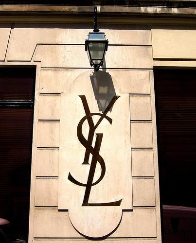
After awhile, he began serving in the French army. Once the war was over, his business was long gone but he still continued working aside from that & still got plenty of well deserved recognition out of it. In 1963 he designed the infamous Yves St. Laurent logo. Five years later, after coping with a long bout of depression, he committed suicide in his homeland of France.
Sheryl Mueller

Tuesday, September 22, 2009

Psychedelic Posters

Below: Wes Wilson


Originally coined by The Beach Boys, the word "psychedelic" has heavy connotations in our society to a specific kind of people. These people are open to expanding their perception and investigating the overlap between art and drugs. They are the hippies. And as important to hippies as their freedom of expression was, they loved the arts.

The psychedelic culture of the 1960s brought about a new appreciation for rock-n-roll with breakthrough musicians like The Beatles and Jimi Hendrix. With this new surge in musical renaissance, a need for art to accompany this music arose. Psychedelic posters drew inspiration for their bulging curvilinear style not only from LSD visuals but mostly from Art Nouveau and some Dada.

The most important aspects of a good psychedelic poster are starkly contrasting colors (to make them stand out), elaborate detail, wide curves, and most importantly, bizarre surrealism that makes one feel "dazed."

I personally love psychedelic art and the artists/musicians associated with it. While I am not a hippie, I still greatly appreciate the culture and the aesthetic that these artists were striving for. They were definitely not out of it when they created these beautiful posters that are really well thought out and revolve around complex themes. The artists conveyed an image and attitude for rock stars through a visual medium in a time when computers did not yet exist. They could not make a Myspace page to promote their band. And music was a lot less convenient to listen to than today. You could not just sample any band's music with the click of a button. Bands had to attract their target audience through these psychedelic posters. If you like the poster, it's very possible that you would like the band.


Above: Bonnie MacLean


And yes, psychedelic posters are hung in art galleries.


Sources:

http://denver.about.com/od/artsentertainment/ig/The-Psychedelic-Experience-/Psychedelic--Yardbirds.htm

http://www.oturn.net/probe/psychedelic-art.html


Tyler Pey

Monday, September 21, 2009

Hannah Hoch


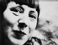
While in class, we spoke briefly about Hannah Hoch, one of the first women in the graphic design industry. Being the person who began to allow both sexes into this art world, I wanted to search more on her background and life.


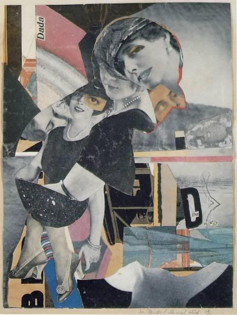
Hannah Hoch was a German Dada artist. Aside from being one of the first women in graphic design, she is also known for being one of the originators of photomontage. Hoch attended the Berlin College or Arts and Crafts and studied glass design and graphic arts, not fine arts, only to please her father. In 1919, she began working with the Berlin Dadists. Here she was a lone woman in the group. She referenced the hypocrisy of the Berlin Dada group and of German Society as a whole in her photomontage, Da-Dandy.


Many of her photomontages point out the faults of the beauty culture. Working at Verlang, she worked with many magazines that targeted women and she began to see how different women in media and reality are. She also made strong statements on racial discrimination in her work.


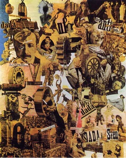
Her most famous piece of art is titled Cut with the Dad Kitchen Knife through the Last Weimar Beer-Belly Cultural Epoch in Germany, pictured below. This piece combines images from newspapers of the time re-created to make a new statement about life and art in the Dada movement.


S. Mueller

Frank Lloyd Wright


In high school, I was set on being an Architecture major and during that time span and even through now, Frank Lloyd Wright has been one of my favorite architects. Compared to others in his line of work and during his working years, he, to me, seemed to always think outside of the box & go one step further with his work, which I love to always try to do.

One of my favorite designs by him was the notorious Fallingwater house near Pittsburgh, PA. Fallingwater was built in 1934 and took three years to complete. It is considered to be a Modernism style and based on the design, I would consider it very modern for its time period.

The idea for Fallingwater came about by Wright saying one simple sentence over drinks at Fallingwater's resident, Kaufmann's, previous home. Wright was speaking with Kaufmann's son when he stated "...this house is not worthy of your parents". Kaufmann had overheard that statement & thus, Fallingwater was born.

It took Wright nine months to finalize the design. In the end, Kaufmann was surprised to see that the house was going to be built above the falls and not underneath like he had anticipated. "The construction was plagued by conflicts between Wright, Kaufmann and the construction contractor. The view of the building is such that the falls can be heard when inside the building, but the falls are visible only when standing on the balcony on the topmost floor. This type of geometrical architecture mystery has even puzzled the architect Wright himself." (Wikipedia).

The house was completed in October of 1937 and in the end cost $155,000, which in 2007 would be equivalent to $2.3 million. In 1963, Kauffman and his family donated the house to the Western Pennsylvania Conservancy and the house currently gets up to 135,000 visitors a year.

http://en.wikipedia.org/wiki/Fallingwater

S.Mueller